Colour of the year 2022 according to Pantone: Very Peri
Meet Very Peri - the colour of the year 2022 by the Pantone Institute! Classic blue is combined here with warmer tones of red, resulting in an energetic, eye-pleasing purple shade. The intention of Pantone experts is to create a colour that symbolizes a dynamic, joyful attitude and encouraging bold creativity. How to introduce this shade to interior decoration? See for yourself!
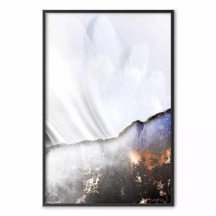
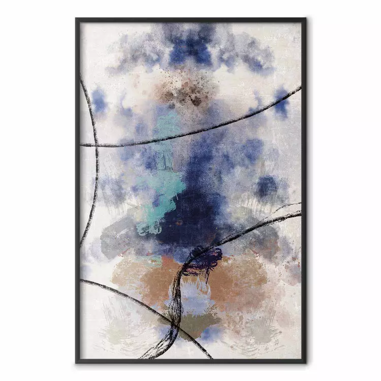
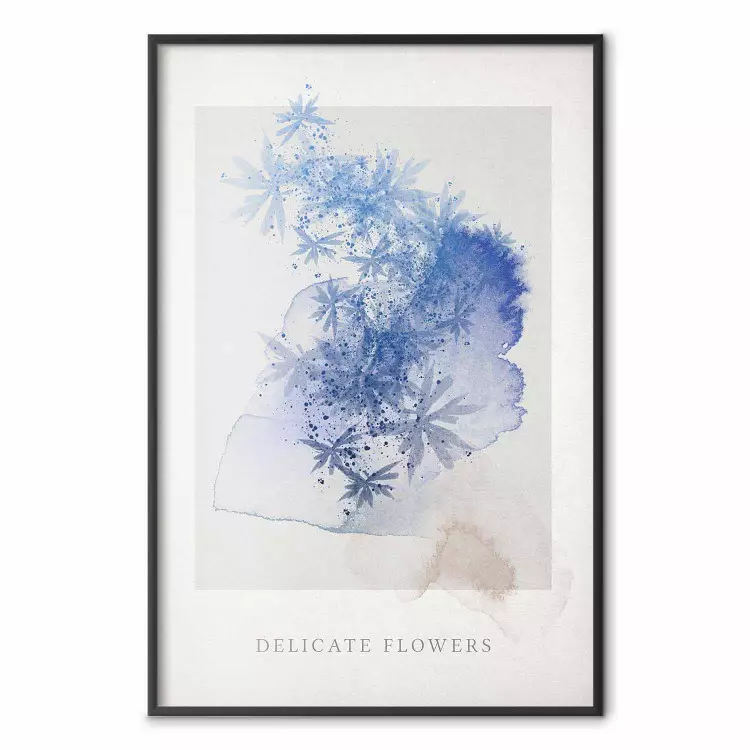
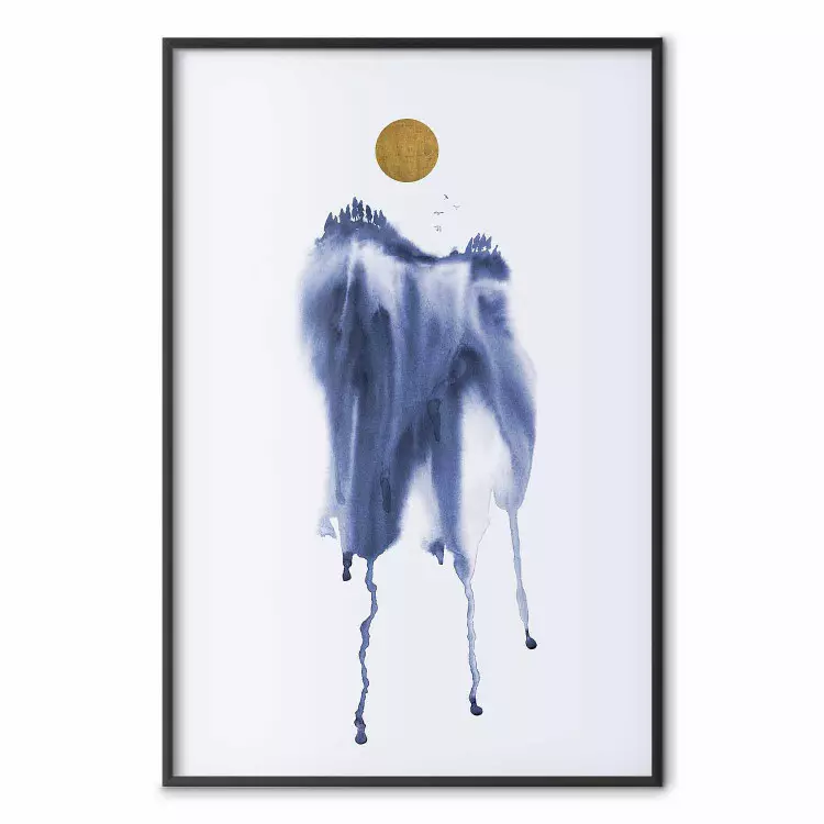
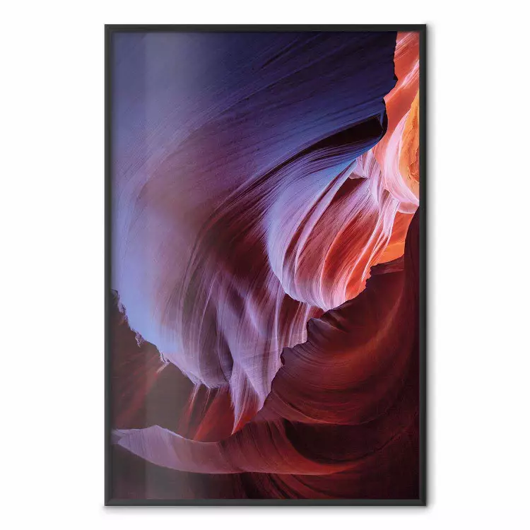
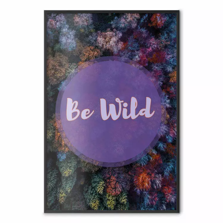
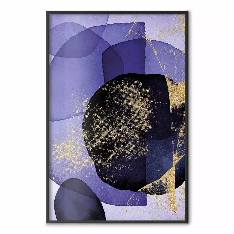
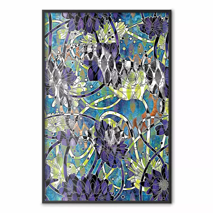
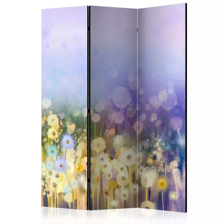
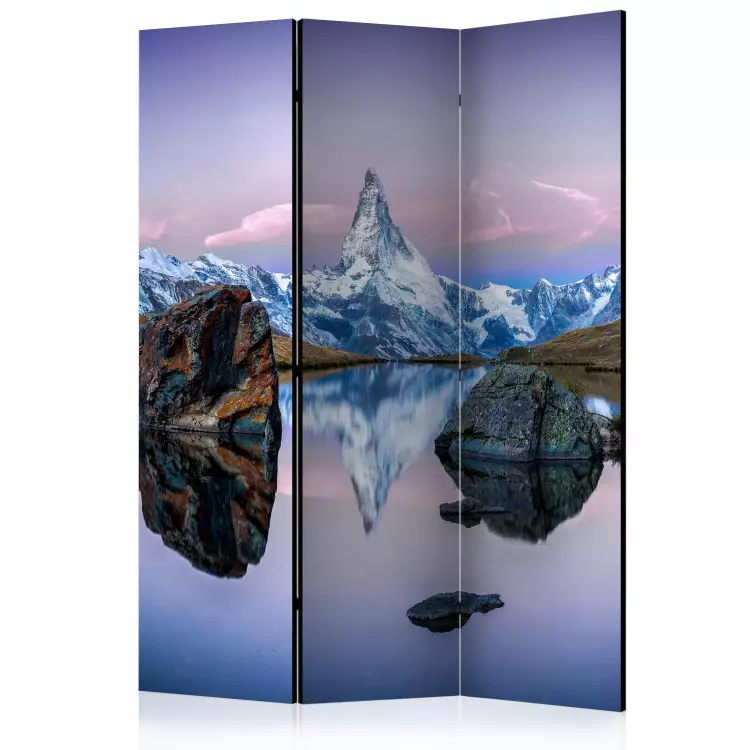
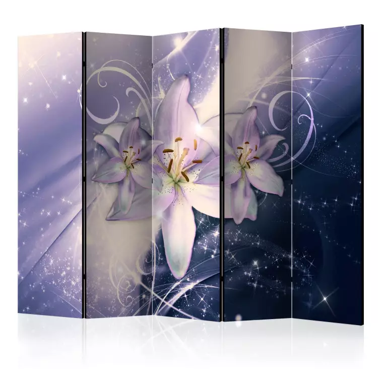
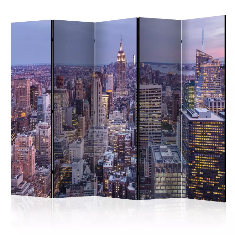
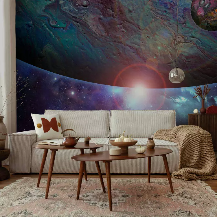
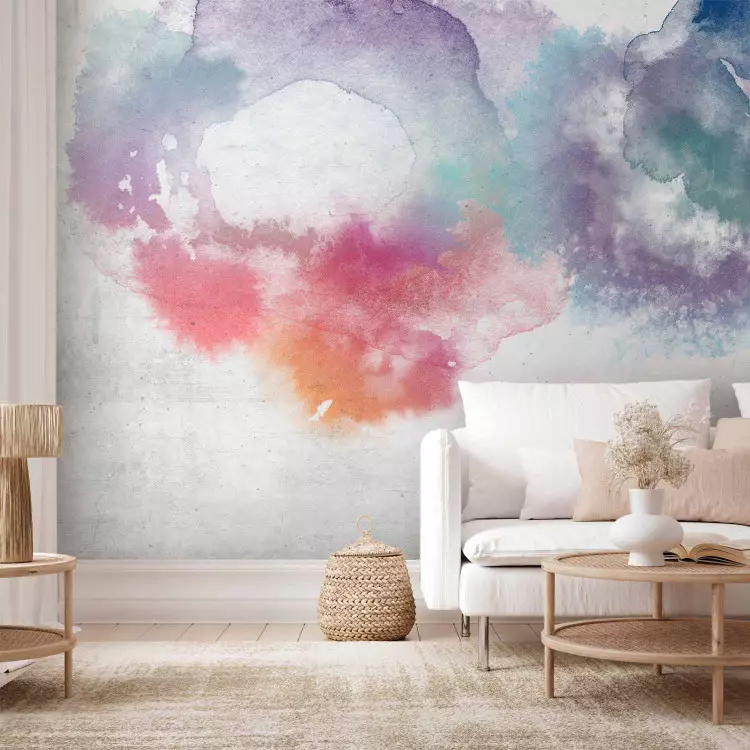
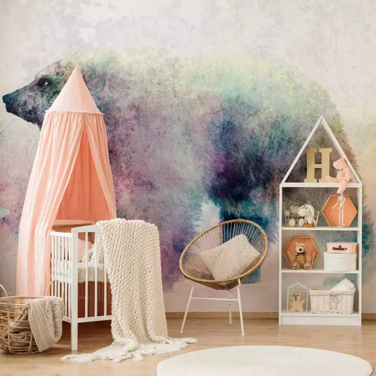
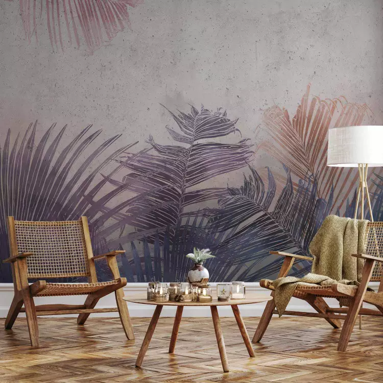
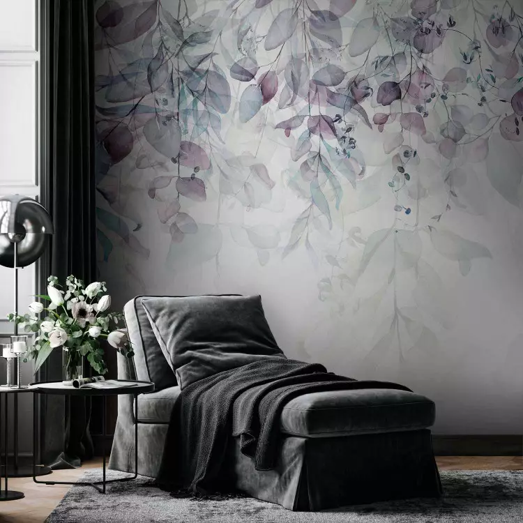
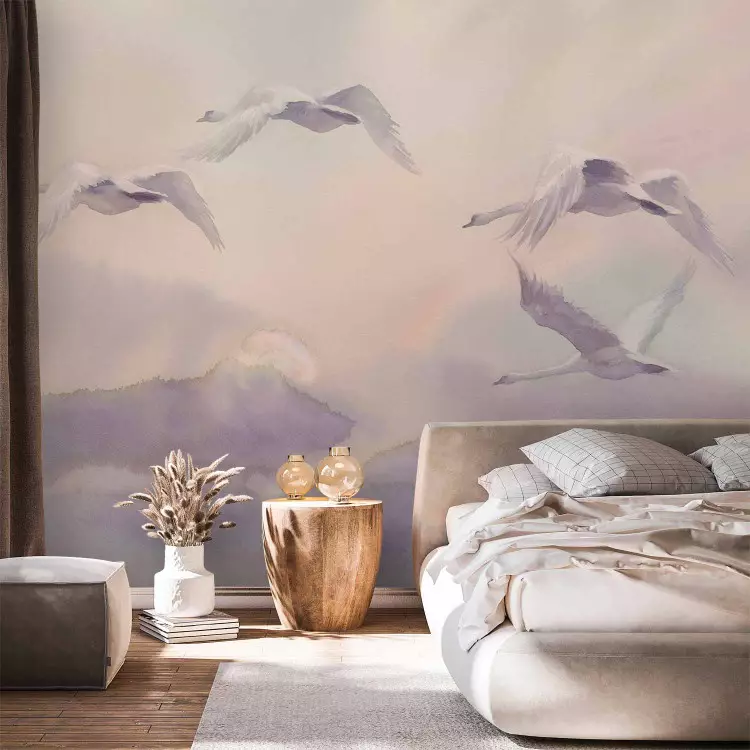
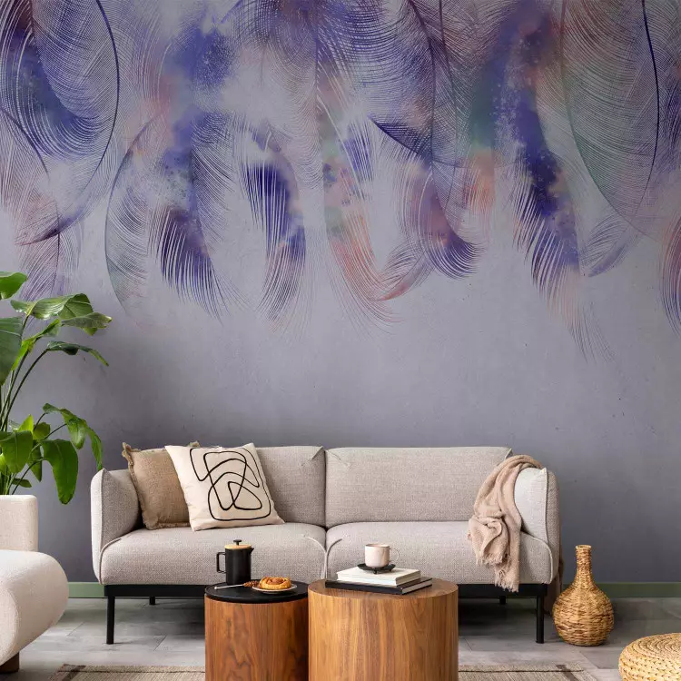
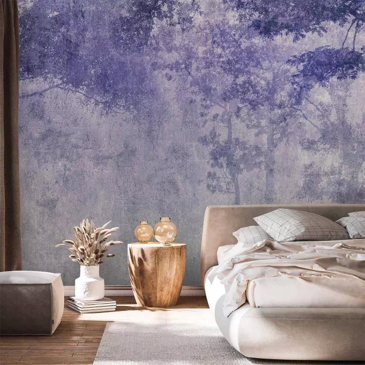
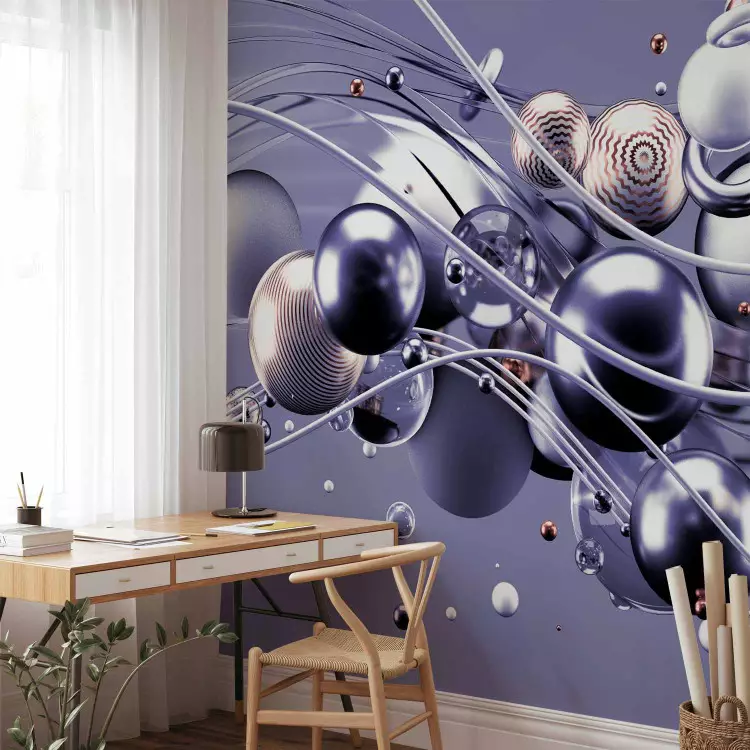
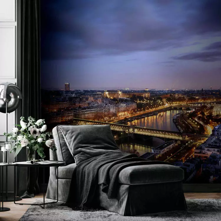
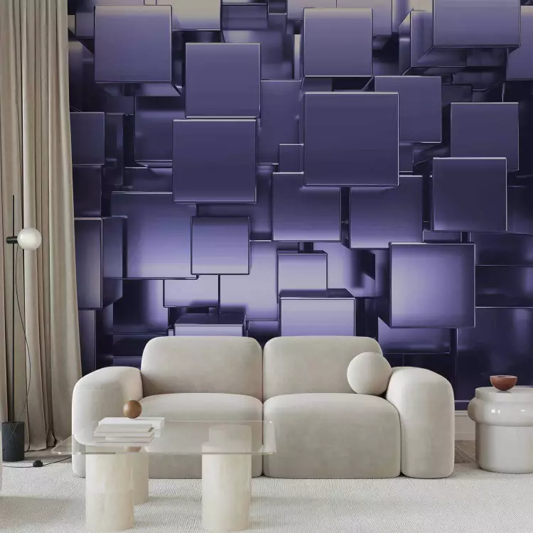
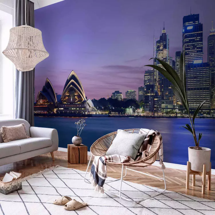
For over 20 years, fashion and design enthusiasts have been waiting for December - that's when the Pantone Institute traditionally announces its choice of the colour of the year. The winning colour is supposed to set the leading trend in the coming year -rule all fashin shows, inspire architects and designers, and catch our attention in art centres. Behind the final choice of the Institute, there is a whole team of experts and analysts who base their forecasts on detailed observations of trends, and the verdict is kept secret until the last moment. This year, the Pantone Institute chose the colour number 17-3938, i.e. Very Peri. The warmest of the shades of blue is reminiscent of the colour of periwinkle flowers - its energy and dynamics are to stimulate creativity and encourage optimistic looking into the future. The energetic Very Peri violet symbolizes boldness, curiosity, self-confidence, dynamism and ingenuity - and its subtle aesthetics make it perfect not only in fashion, but also in interior decoration. Meet the bimago wall decorations collection inspired by the new Pantone colour!
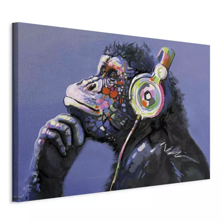


![Silvery Landscape II [Large Format]](https://art.bimago.media/media/catalog/image/view/product/137554/role/small_image/size/750x1120/0378534c03e4a5e168c17de75bcc6ad3.webp)
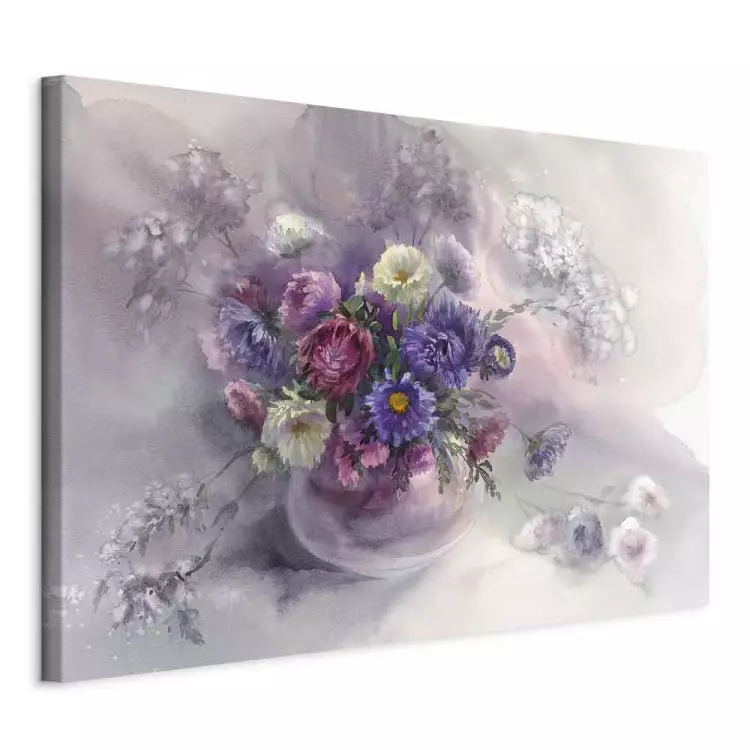


![Lavender Sunset [Large Format]](https://art.bimago.media/media/catalog/image/view/product/125592/role/small_image/size/750x1120/256068d4b7fd76222c01b1e834dcff9d.webp)
![Magnolia Park - Violet [Large Format]](https://art.bimago.media/media/catalog/image/view/product/128633/role/small_image/size/750x1120/9f4952f59afa896a0eddd96b2b7ed3d4.webp)
